My Role
UX/UI designer.
Responsabilities
Conducting interviews, papers and digital wire framing, low and high-fidelity prototyping, conducting usability studies, accounting for accessibility, and iterating on designs.
Project duration
December, 2024 to January, 2025
Project Overview
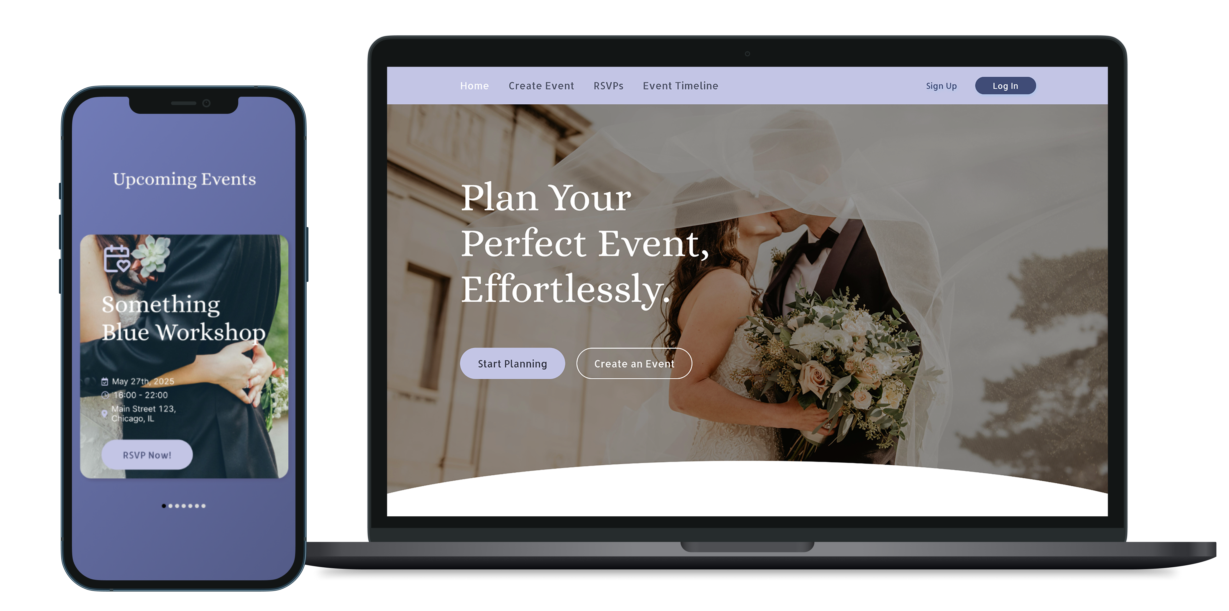
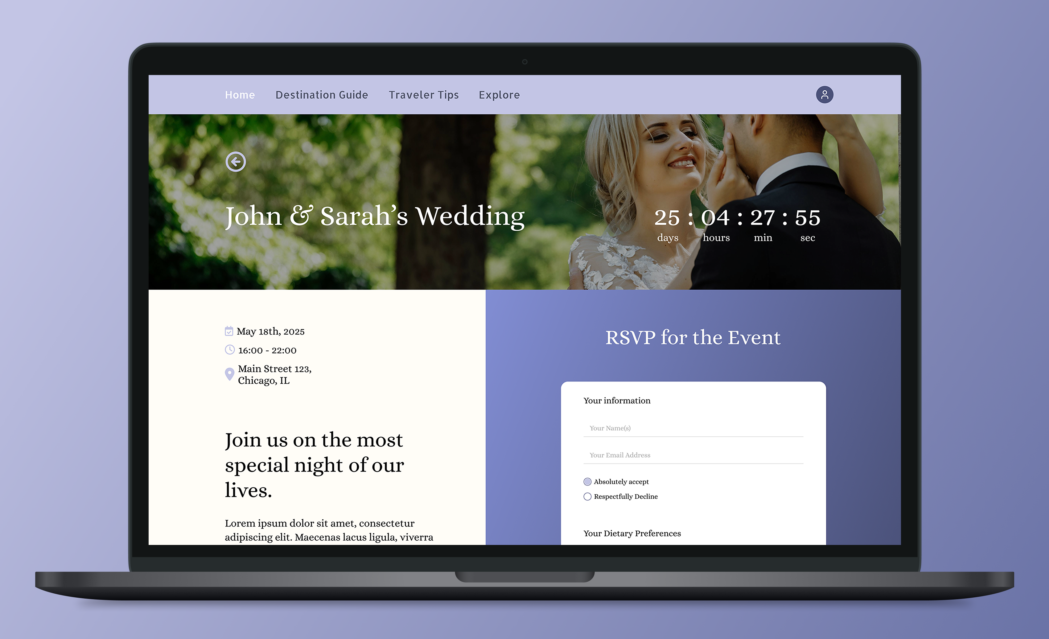
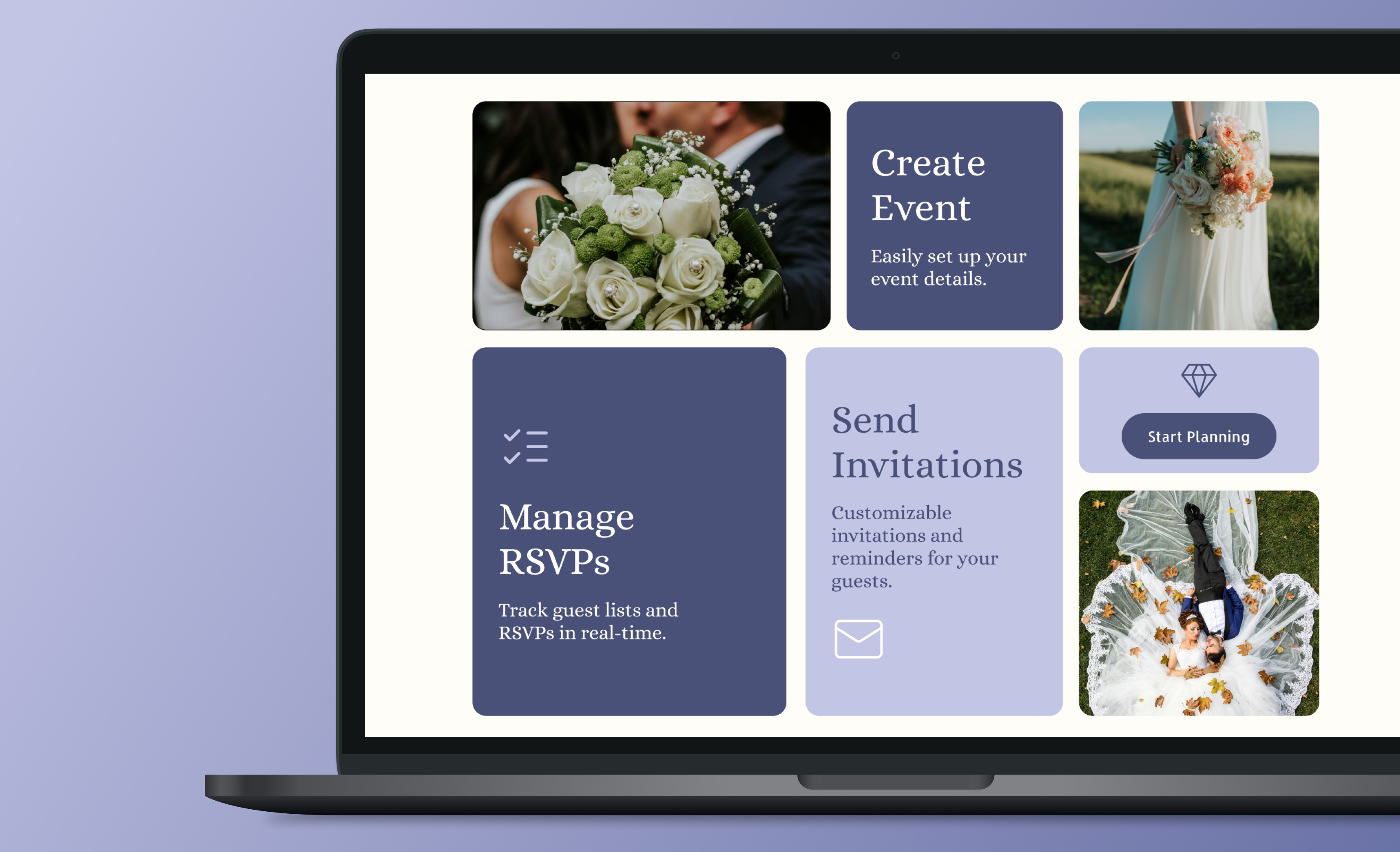
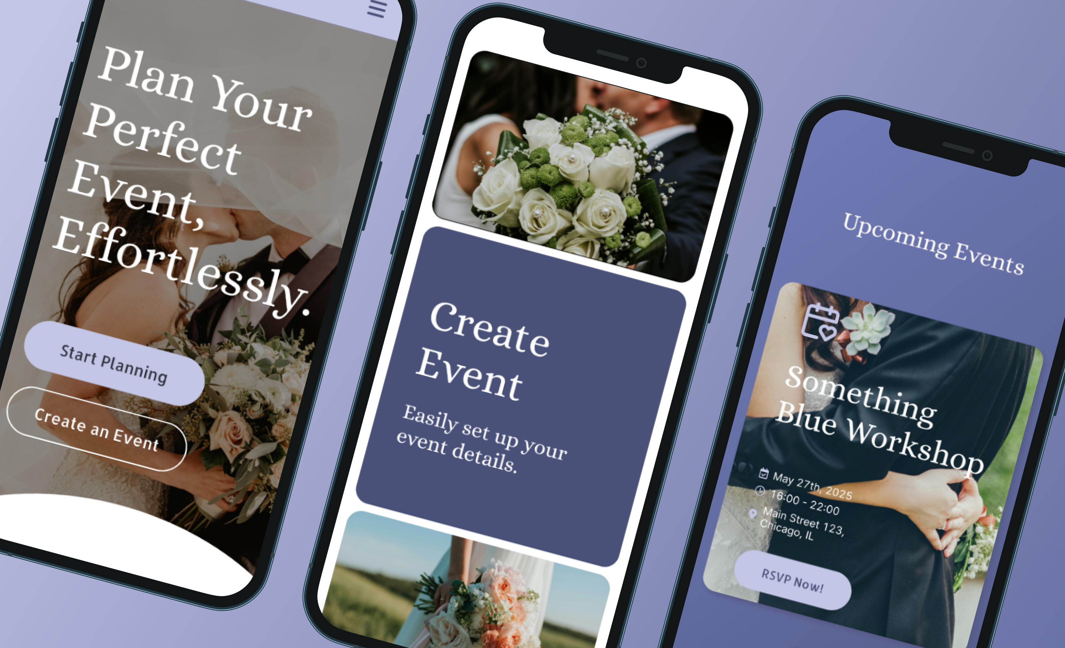
EventEase is an all-in-one event planning platform that simplifies the process of creating, managing, and tracking events. It allows users to easily create events, send customizable invitations, track RSVPs, and manage guest lists. The platform is designed for both personal and corporate events, ensuring ease of use for all kinds of occasions.
The Problem to Solve
Event planners, both professional and personal, often struggle with managing guest lists, sending invitations, and tracking RSVPs efficiently. Traditional methods like spreadsheets and paper invites are cumbersome and prone to errors. There was a need for a digital solution that could handle all aspects of event planning in one streamlined interface.
How We Could Solve It
We created an intuitive, easy-to-navigate platform that automated the entire event management process. From event creation and invitation design to RSVP tracking and guest communication, every feature was designed to save time and reduce stress for event planners. We focused on offering customizable templates, real-time RSVP tracking, and seamless integration with social media for easy sharing.
Research Methods:
• User Interviews: We interviewed event planners (both professional and personal) to understand the challenges they face with guest management, RSVPs, and event communication.
• Surveys: Distributed surveys to gather data on users’ preferred features for event planning and RSVP management, including customizability and ease of use.
• Competitor Analysis: Analyzed current event planning tools to identify key pain points and areas for improvement, such as limited customization and tracking inefficiencies.
Interview Insights:
• Event planners frequently struggled with managing large guest lists and tracking RSVPs in real-time.
• Customization of invitations was essential for event organizers to align with the theme of their events.
• Users often felt frustrated by the lack of integration between invitations, RSVPs, and follow-up communication.
User Personas
• Charlotte, 35: A wedding planner who manages large-scale events and needs a system that streamlines guest list management, tracking, and communication.
• Mark, 27: A tech-savvy individual who plans corporate events and values seamless integration with other digital tools like calendar apps and email platforms.
Key Motivators
• Efficiency: Streamlining the process of guest management, from invitations to tracking RSVPs.
• Customization: Offering customizable templates for invitations and event pages to meet the unique needs of each event.
• Integration: Ensuring seamless integration with other platforms, such as calendar apps and social media, for better guest engagement.
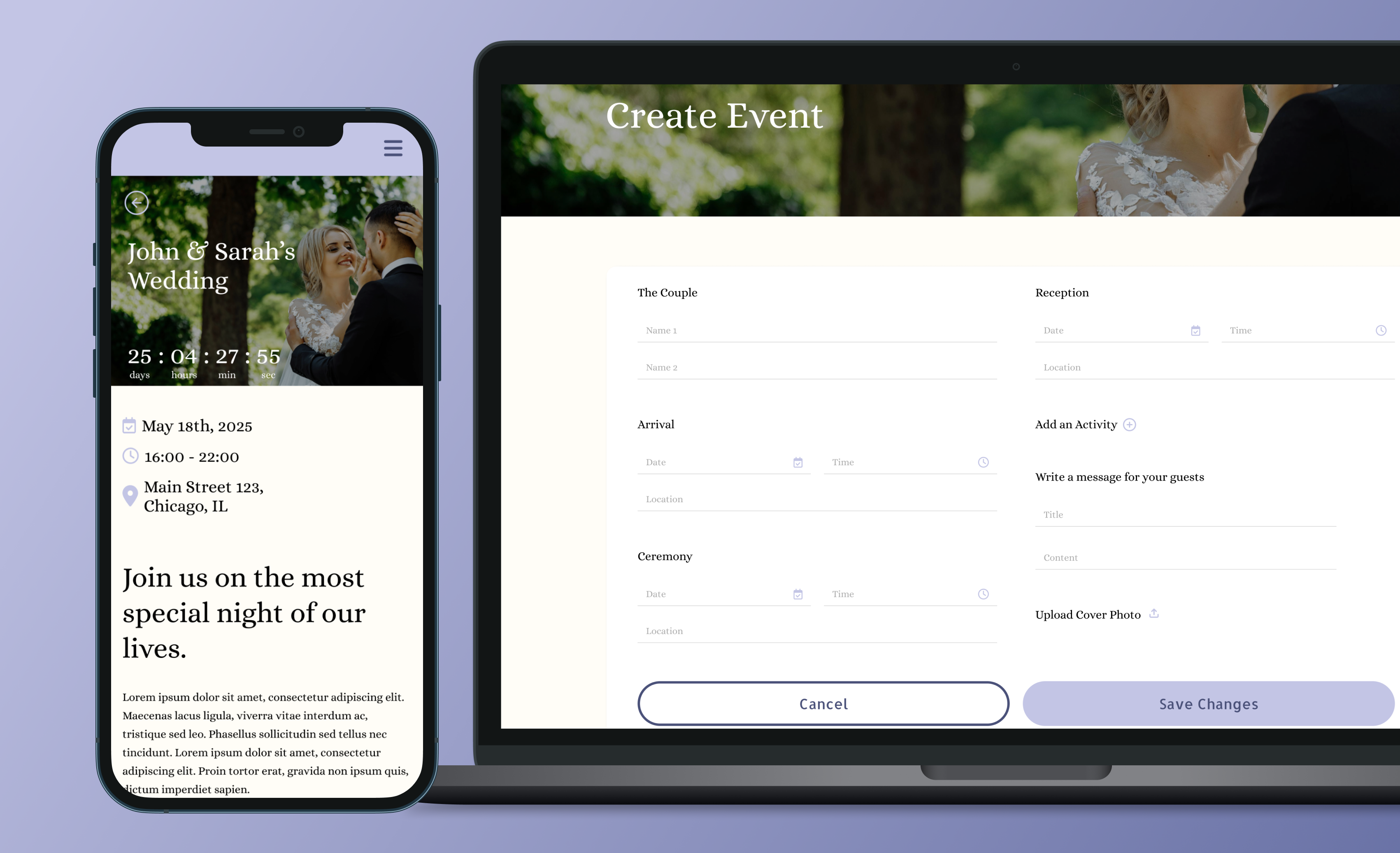
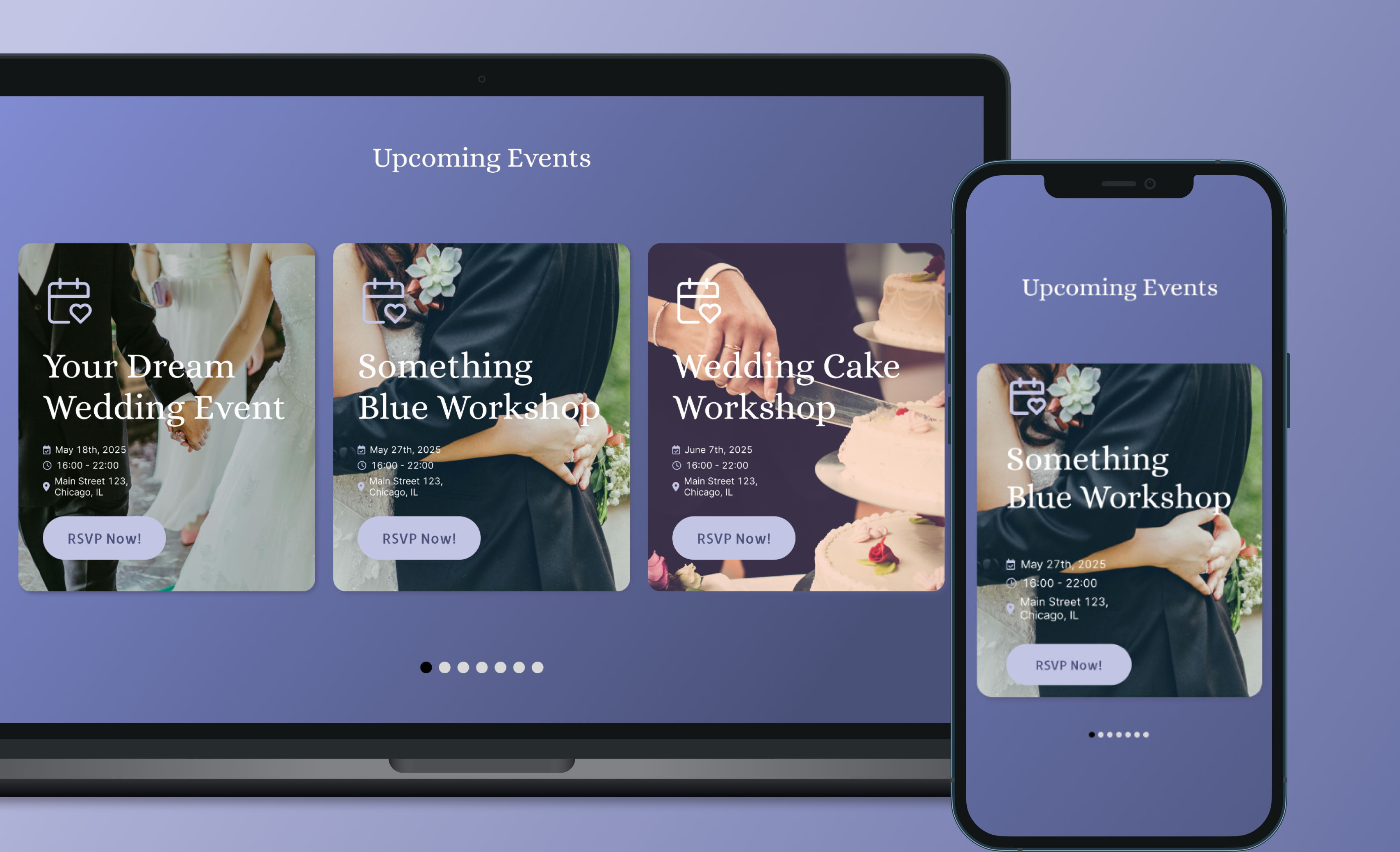
The Design
We focused on creating a simple and intuitive interface that allowed event planners to create events, send invitations, and track RSVPs in a few steps. Customization was a key aspect, offering flexible templates for invitations and event pages. We also prioritized mobile responsiveness to ensure easy access on all devices, especially for event planners on the go.
The Result & Learning
The platform saw a 45% reduction in the time spent on manual guest list tracking and a 35% increase in engagement with event invitations. The simplicity of the RSVP system contributed to improved communication between event planners and guests. A key takeaway was the importance of offering flexibility in design without compromising ease of use. Additionally, we learned that integrating with calendar tools and social media platforms enhanced the overall user experience and improved event participation.